Old Dutch Foods
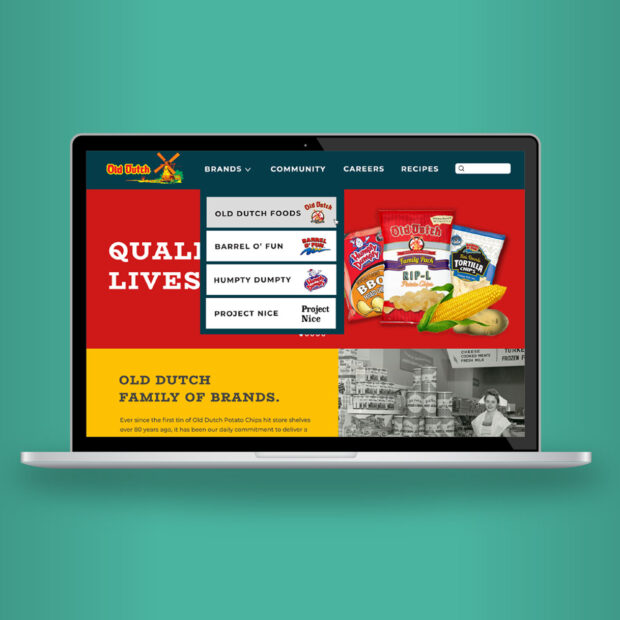
In much of Canada and the Midwest, Old Dutch is a household name known for delicious snacks, including their iconic potato chips that have graced meal plates for over eight decades. With three distinct brands under the Old Dutch Foods parent company, they have a lot to offer, which inherently meant a challenge when it was time to redesign their corporate website.
Challenge
Those who know and love Old Dutch may not know it’s a family-owned company, but they do recognize many of the brand elements that have made up the packaging for literal decades. While their packaging continues to be a valuable brand asset with plenty of equity, their website had become unwieldy with dozens of pages of legacy content that desperately needed to be winnowed down and reorganized.
Solution
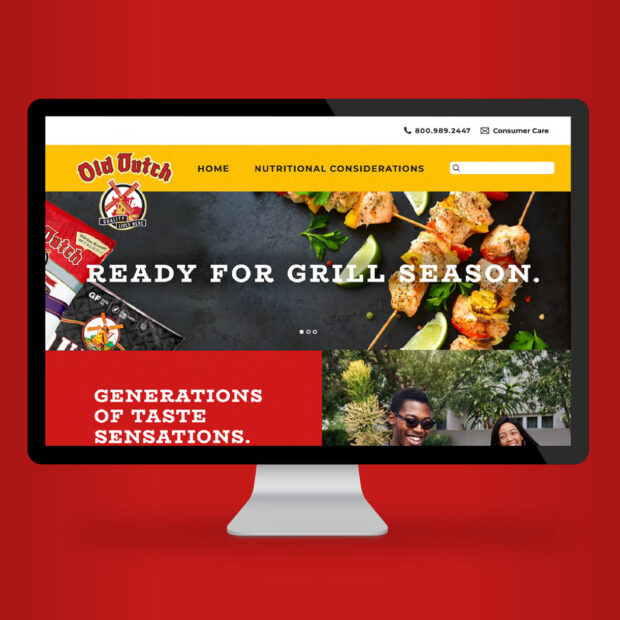
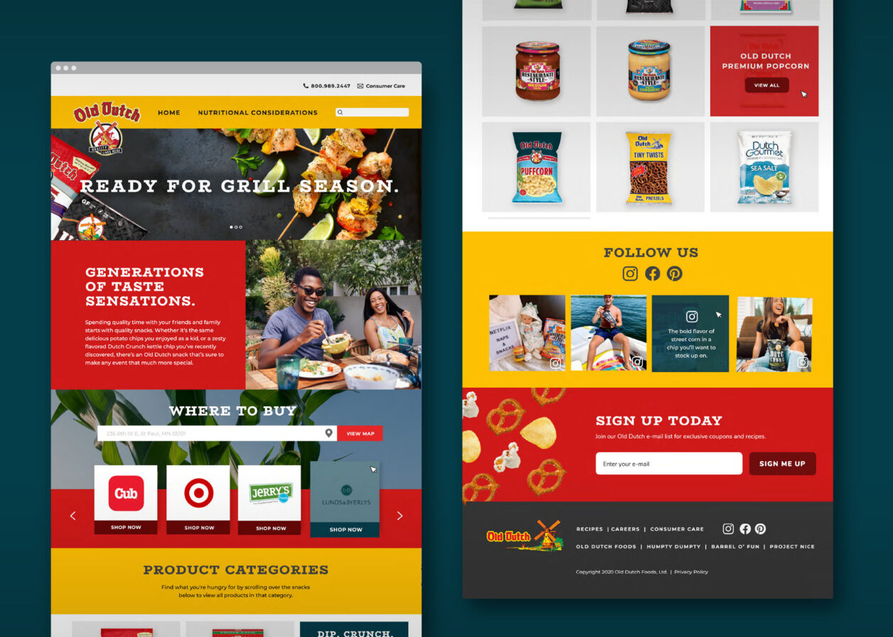
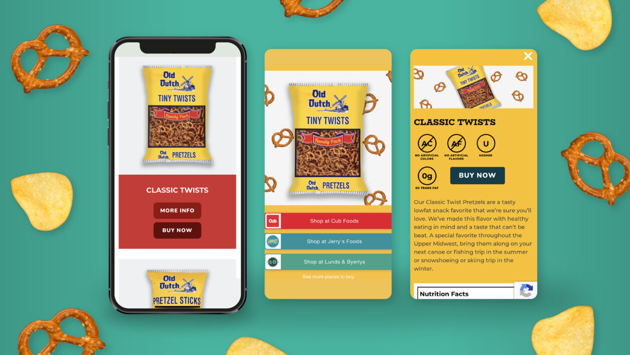
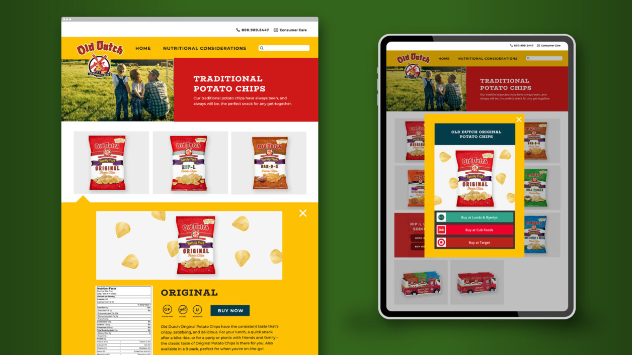
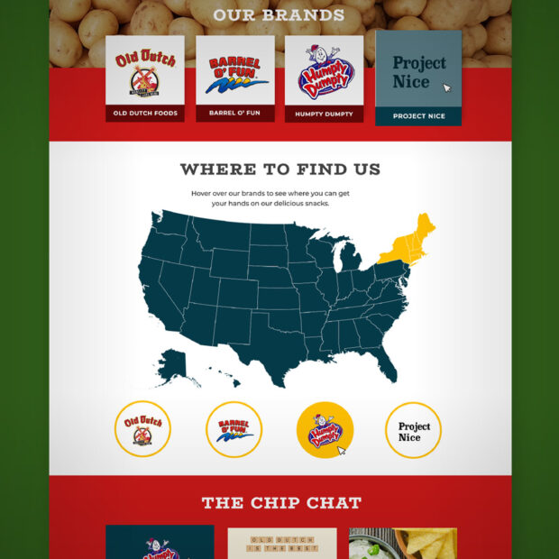
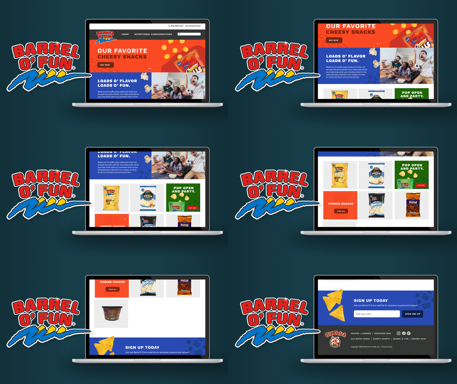
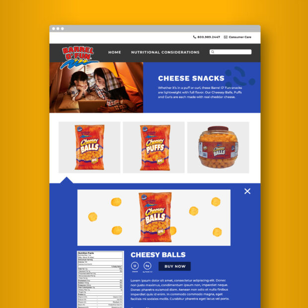
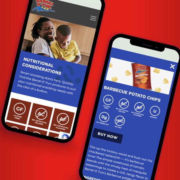
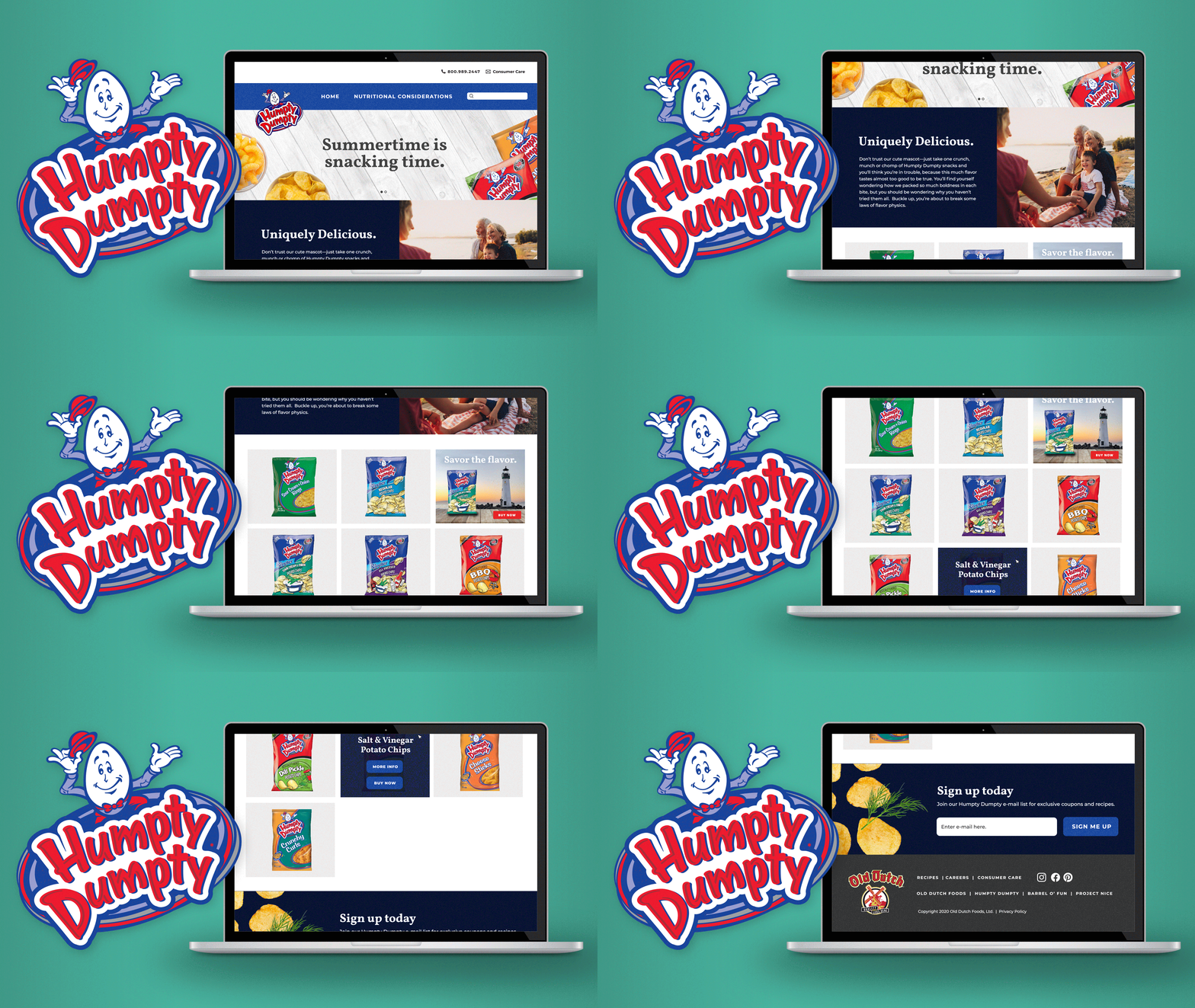
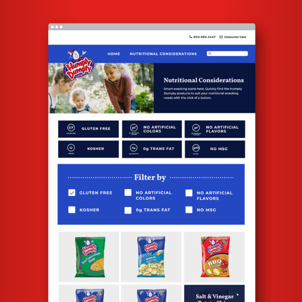
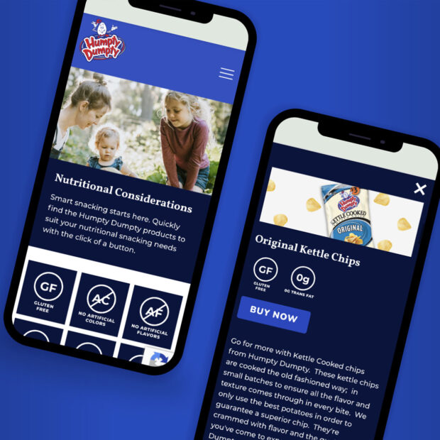
Maintaining their brand equity while presenting a fresh, modern, and streamlined website required Spot to focus first and foremost on user experience and leveraging audience insights to make informed content hierarchy decisions. From there, we designed an interactive experience that brought priority engagement areas to the forefront with bold color and vibrant photography to accentuate their many products. We also added helpful new features for customers like a Store Locator that aggregated previously unavailable data to make purchases easier than ever.
Results
The relaunched site has seen an uptick in engagement and average time spent on pages. It continues to be a flexible, responsive solution that the internal marketing team is able to update regularly, and since its launch, Spot has gone on to design and support launches of several new brand landing pages as Old Dutch continues to innovate its product lines to meet the needs of the next generation of snackers.
